ACY Securities app is a trading and investment platform designed to offer users advanced tools for CFDs trading, market analysis, and portfolio management. It’s ideal for both beginners and experienced investors looking to make informed decisions.

Roles and Responsibilities
I was the sole designer for this project, responsible for the entire design process from research to final implementation.
Conducted user research to identify key pain points and validate design decisions.
Designed user flows, wireframes, prototypes, and high-fidelity UI to enhance the trading experience.
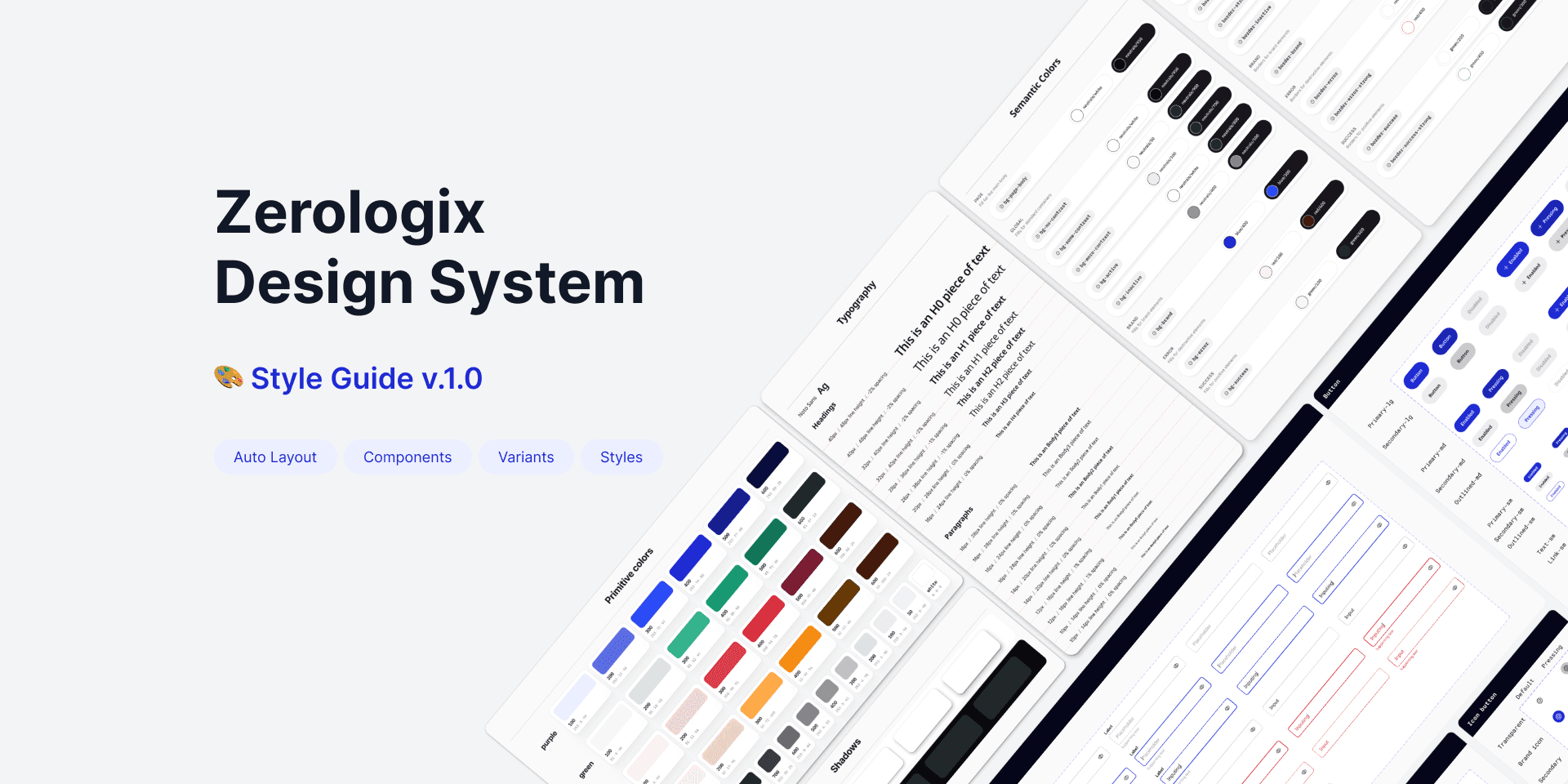
Established a scalable design system to ensure consistency across the platform.
Collaborated closely with product managers and stakeholders to define the vision, prioritize features, and align design with business goals.
Worked with developers, QA engineers, and compliance officers to ensure smooth implementation and regulatory compliance.
Oversaw design QA, providing feedback to ensure accuracy in execution.
Prepared design documentation for handoff and implementation.
When an Outdated Platform Became a Growth Roadblock
ACY Securities was founded in 2013 with a range of web-based platforms. As our business grew rapidly, we noticed that many of our customers were accessing our websites on their phones. Starting in 2022, we began receiving significant customer feedback indicating that our web-based platforms were complex and inefficient to use.


web-based platforms (Before)


80% of our leads came from sales contacting them via phone calls, requiring significant manual effort. Our business relied more on marketing than on product-led growth.
As a result, our sales didn’t grow as quickly as expected.
In addition, existing customers expressed a strong desire for a mobile app that would allow them to trade and manage their funds anytime, anywhere.
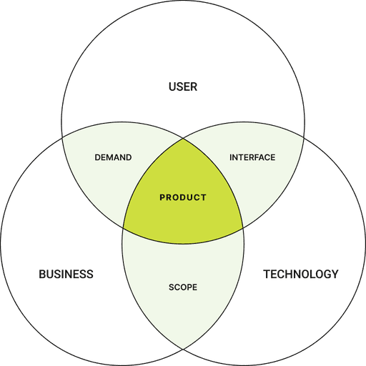
Before starting this project, I spoke with our stakeholders to understand our business goals. As a fintech designer, I have to consider business goals to ensure my designs not only enhance user experience but also drive revenue and support business growth.
Business Goals
🎯 Expand Market Reach
Attract newbies and experts alike, build a trading platform that suits everyone. Remove the barriers to entry and make investing easy.
🎯 Increase Trading Volume
Facility quick and easy execution of trades, implement advanced tools to encourage timely decision-making and increase trading frequency.
🎯 Build brand loyalty and trust
Engage customers directly and instantly, retain customers and foster long-term relationships.
Strategic Design Collaboration: Balancing Business, Users, and Tech
🧭 Identifying Market Gaps: Integrating Trading Functionality
Initially, stakeholders aimed to focus only on fund and account management for the app, reflecting our web-based platforms where trading, account, and fund management were separated. However, my market analysis revealed that competitors had integrated these features into a single app, creating a seamless user experience. So I proposed adding trading functionality to align with market trends and enhance our competitiveness—a recommendation that was approved.


Market Analysis
🧭 Working with Developers to Ensure Feasibility
With a tight 6-month launch deadline, I worked closely with backend and system architecture teams to address the technical complexities of integrating trading features. Recognizing that trading apps depend heavily on accurate and stable backend systems, we faced a critical decision: rather than building a new system architecture—which would have been infeasible within the timeframe—we opted to retain the existing architecture to save time. Updates were made only when absolutely necessary to ensure compatibility and functionality.
🧭 Focusing on Usability and Integration
Within these constraints, I prioritized enhancing the user experience by addressing usability issues, creating new user flows to accommodate the integrated trading features, and simplifying existing workflows. I ensured the seamless integration of trading, fund, and account management features, delivering a cohesive and efficient app experience.
I initiated interviews with 15 users to understand what they value and what confuses them on our existing platforms. I also facilitated 5 internal interviews with customer service and sales teams to gather client feedback from their interactions.
Additionally, I analysed user behavior through mouse tracking and heatmap data, ensuring our design decisions were grounded in both qualitative and quantitative insights.

Findings from User Research
I grouped all the user feedback into 3 themes.
Fund Management
Complicated withdrawal process and long waiting times to verify bank information.
Failed money deposit and withdrawals with no reasons given.
Unclear instructions for money transfers, and no timely notifications regarding the money process.
Long lists of payment methods that confuse users and uncleared verification processes.
Users can’t view balance, equity, and margin information at a glance.
Trading
Novice traders feel overwhelmed with complex trading terms, order types and advanced tools.
Struggles with unclear fee calculations and information when placing orders.
Requires switching between different apps to gather information for making trading decisions.
Professional traders find it hard to locate the needed tools from the cluttered interface.
Professional traders need more quick execution tools.
Accounts Management
Inefficient opening account process, difficult to finish ID check.
Confused to choose and switch accounts.
Missed important information among various notifications and emails.
To develop the app's first version, I began by restructuring the information architecture (IA) of key features selected by stakeholders. This step clarified what to keep, integrate, or remove, leading to a new IA for the app design.
Insights from Previous IA Analysis
Redundant Features: Many features, especially in the fund management section, were slightly different but repeated. This forced users to switch between platforms for trading decisions.
Inconsistent Login Processes: Users needed different usernames for each platform, disrupting the experience.

IA (Before)

IA (After)
Beginner traders struggled to understand professional terms and order types like market, limit, and stop orders.
This confusion caused delays in placing trades.


I simplified the 'Market Order' by replacing it with a straightforward 'Buy + unit + current price' button. To reduce confusion, I merged 'Limit Order' and 'Stop Order' into a single action: 'Buy when price is,' removing the need for users to differentiate between the two.
Additionally, I grouped 'Stop Loss' and 'Take Profit' as separate, optional settings to streamline the process.
To enhance usability, trading settings are arranged vertically in a toggle format, guiding users step by step in a logical sequence.
Users encountered difficulties during deposits and withdrawals due to complex verification processes and a lack of clear guidance. This often led to delays in transactions and concerns about fund security and fees.


Users have difficulty distinguishing between account types and sub-accounts, causing confusion when switching.


Preparing for the handoff is crucial to ensure smooth implementation, design consistency, and clear communication between designer and developers.

Design System
Created a comprehensive system with reusable components and integrated both light and dark modes for easy implementation.
Figma Documentation
Mapped out clear user flows and annotated Figma files to guide developers, covering all scenarios to avoid confusion.


Anticipating Edge Cases
Documented edge cases to ensure smooth implementation and testing, preventing delays from unexpected issues.
I led the validation process through usability testing, A/B testing, and behavioral analysis, ensuring the prototype was efficient, user-friendly, and aligned with business goals.
⬆️ Task Efficiency & Usability Improvements
Order placement time for beginners decreased by 23% after refining order type labels.
Account switching accuracy improved to 92% after refining the UI hierarchy.
Prototype usability score (SUS): 82.4 (above industry benchmark of 75).
90% of participants found the new onboarding flow easier to complete than the original.
Users rated clarity of order placement at 4.3/5, compared to 3.7 in the initial version.
🤝 Developer & Business Feasibility
"Early design-developer alignment really streamlined our process. The well-documented UI and system architecture considerations helped us optimize workflows, reduce redundancy, and cut down development time by around 15%."
– Tech Lead
"The updated flow resolved some of our most common pain points, especially around account switching and fund processes. We anticipate fewer customer inquiries as a result."
– Customer Support Team
Reflection & Next Steps
Designing for both beginners and experienced traders is always a balancing act. While the redesign improved clarity for new users, feedback showed that advanced traders need more control and customization. Moving forward, the focus will be on refining the experience to cater to both user groups effectively.
📊 Balancing Beginner-Friendly Design & Advanced Features
The current design improves clarity for beginners, but experienced traders require more customization and advanced functionality. Future updates could introduce a Pro mode with deeper market insights, advanced charting tools, and customizable order settings.
📈 Price Alerts for Proactive Trading
To help users stay informed without constant monitoring, implementing customizable price alerts will enhance trading efficiency and engagement.
🤖 AI-Powered Trade Analysis & Risk Management
Integrating AI-driven market insights can provide personalized trading recommendations, while automated risk alerts can help users adjust stop-loss settings and manage exposure more effectively.
👥 Social Trading Integration
Adding Copy Trading functionality will enable users to follow top traders’ strategies, bridging the gap between beginners and experienced investors.