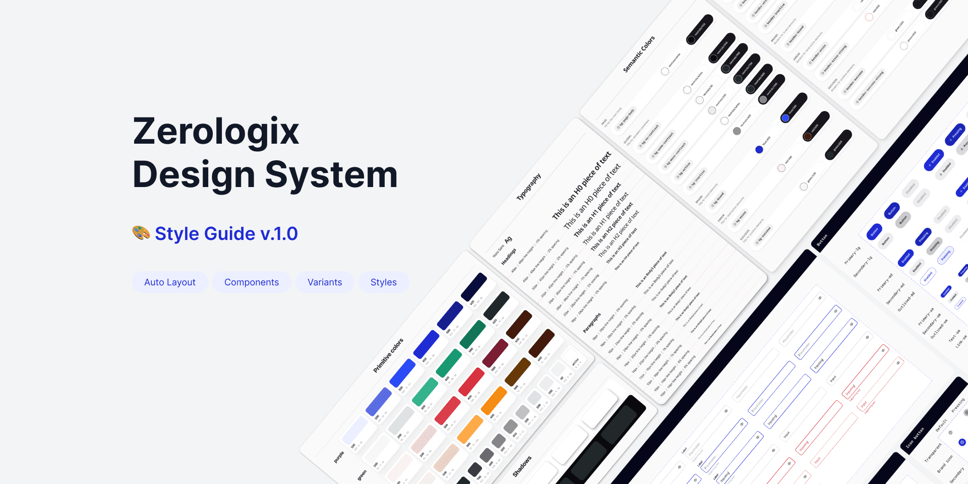
Zerologix Design System
The Zerologix Design System (ZDS) is a scalable, accessible, and developer-friendly system that unifies design across mobile, tablet, and web platforms.
When I joined Zerologix, it became clear that designers and developers were working in silos, each creating their own versions of buttons, inputs, and layouts—similar yet inconsistent.
This lack of a single source of truth led to redundant work, UI inconsistencies, and slow development cycles, making it challenging to maintain consistency across mobile, tablet, and web.
Challenge
Collaboration
Designers and developers worked independently, causing misalignment.
Lack of reusable components increased development time.
Developers struggled with unclear design specifications.
User
Different styles and behaviours confused users.
Many elements failed WCAG compliance.
Inconsistent interactions across different platforms.
Outcomes
✅
Built a centralized, scalable design system (ZDS) for UI consistency.
✅
Unified UI components across platforms, ensuring a consistent experience for users.
✅
Enhanced accessibility, ensuring WCAG compliance.
✅
Built-in code adoption ensured smooth implementation, reducing design-to-development time by 40%.
✅
Achieved 100% adoption across product teams.
As a product designer in fintech, I built a design system emphasizing reliability and trust—key for trading firms. Our goal was to make trading more accessible to users aged 26-40 while maintaining familiarity for existing customers.
To achieve this, we established five core principles:
💼 Professional
Reflects the seriousness and trustworthiness of a fintech product.
🎯 Approachable
Engages younger customers and creates a welcoming experience.
🚀 Tech-Savvy
Communicates our cutting-edge capabilities, appealing to both new and experienced users.
♿ Accessible
Meets WCAG standards for inclusivity, making trading tools usable for a diverse audience.
I standardized color variables, typography, and responsive grids to ensure consistency, scalability, and seamless adaptation across devices.


Color Variables (component level)
Standardized light and dark mode color palettes, defining clear usage rules for consistency across components.

Text Styles
Predefined font styles, sizes, weights, line heights, and spacing for different text elements.
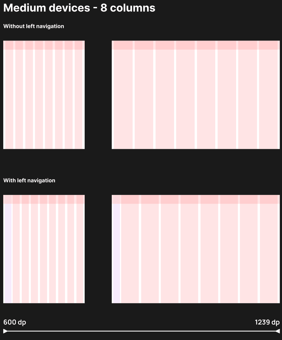
Grid & Breakpoints
Ensures layouts adapt seamlessly across devices.


Core Components
To quickly launch Version 1.0, we audited existing UI elements to identify inconsistencies and redundancies, allowing us to focus on the most crucial components for immediate use.

Boolean Variables
Enabled toggling of component properties, reducing variants and streamlining design.

Dark & Light mode
Standardized color components to ensure a seamless switch between light and dark modes.

Designing for Everyone
WCAG-Compliant Contrast – Ensured readability for users with visual impairments.

Developer Adoption
Provided code-ready components and documentation to streamline implementation and ensure design consistency.
After implementing ZDS, I worked with designers and developers to assess its impact on efficiency, consistency, and collaboration.
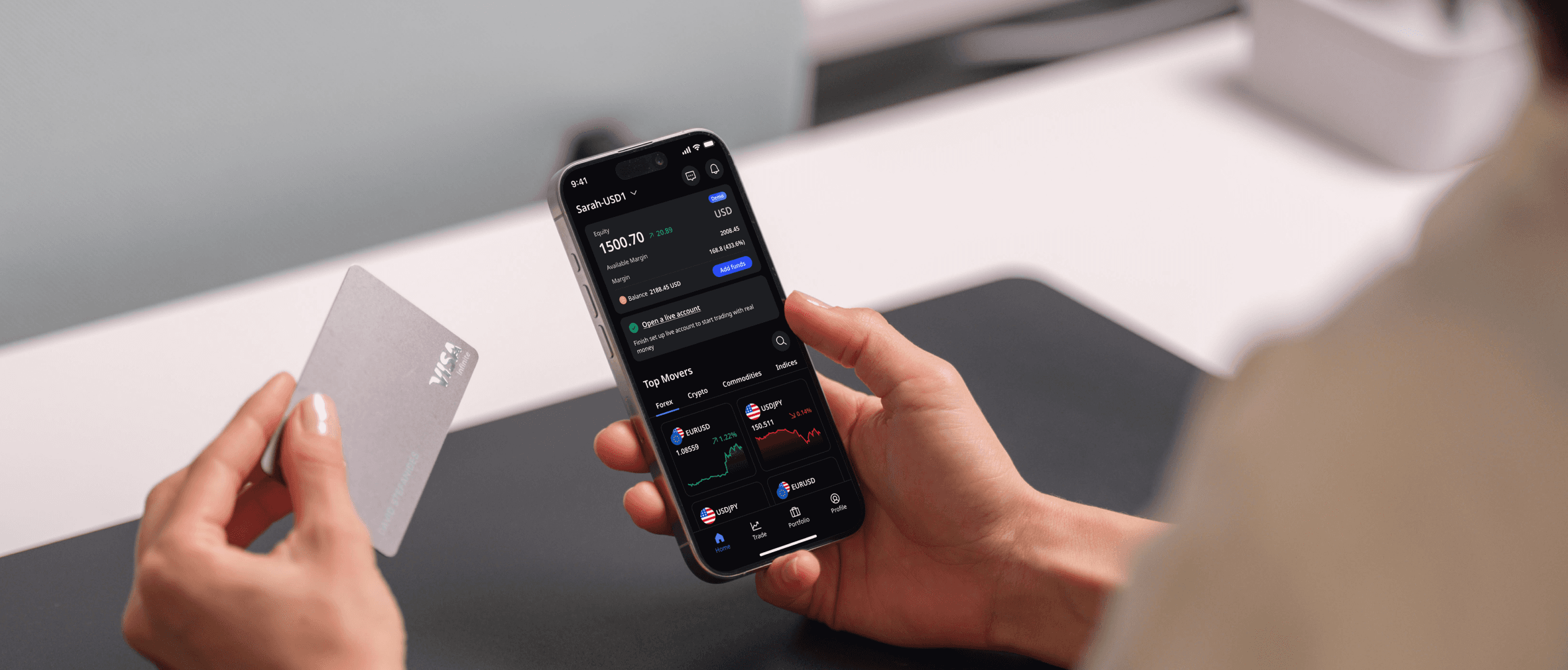
Acy Securities app is a one-stop trading platform that allows users to trade CFDs with a variety of financial tools.
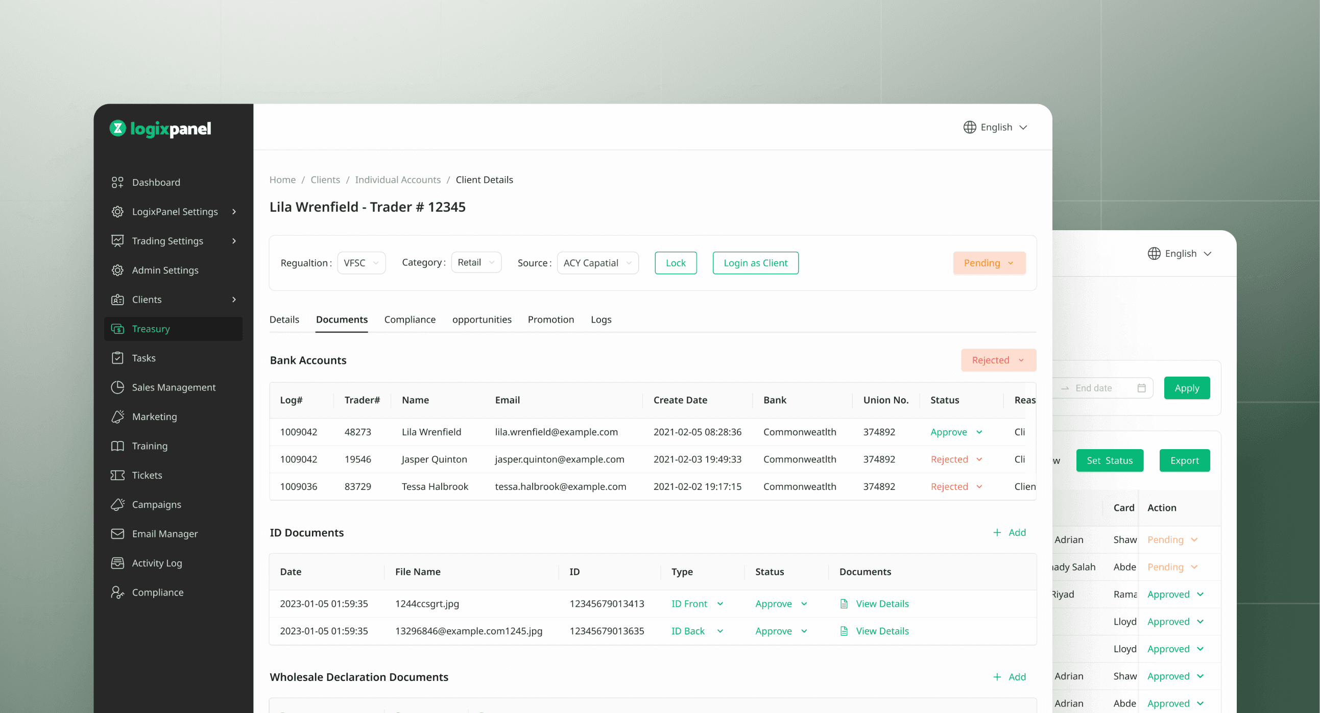
Logixpanel is a B2B admin portal that streamlines brokerage operations, from client management to treasury processes.
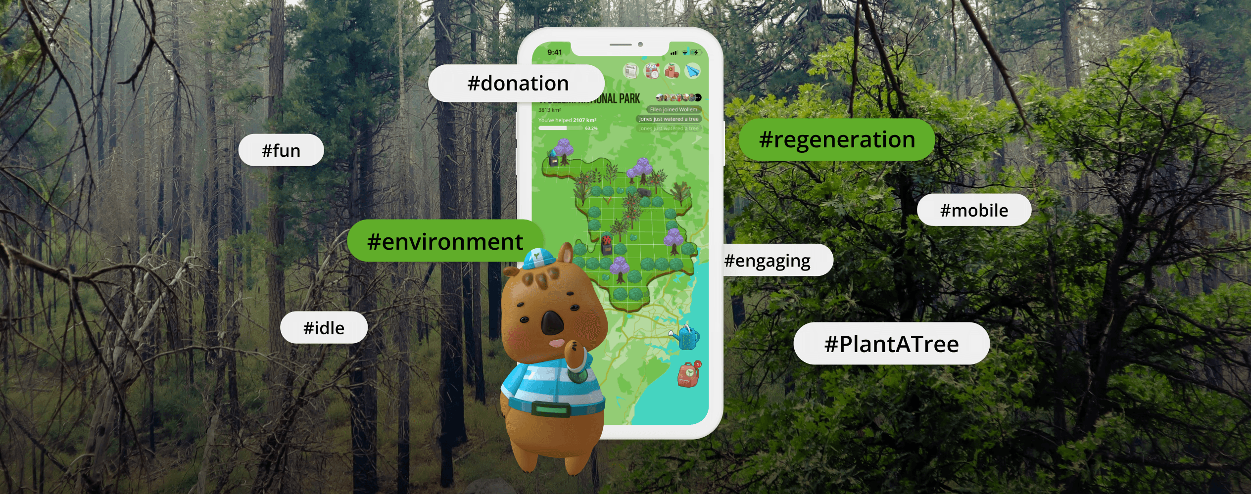
2 Billion Trees is a mobile app that motivates individual donors and make personal contributions continuously through gamification.